Using Trend Lines in Technical Analysis
Trend lines are a simple and widely used technical analysis construction drawn on the price charts of traded securities. Historically, trend lines used to be drawn by hand on paper charts, but these days it is much more common for trend lines to be drawn on computer-based, often real-time, charts using a mouse or even automatically.
A trend line is a bounding line for the price action (or less commonly other charts) of a security. The principal trendline is an upsloping line drawn through lower extremes of price for a security that is in an up trend, or its mirror image, a downsloping line drawn through the upper extremes of the price action for a security that is in a down trend. This differs from the trend lines defined using least squares regression or similar methods, where the data points are distributed on both sides of the line.
The other, less widely used type of trendline is an upsloping line drawn through high extremes in an uptrend, or a down sloping line drawn through lower extremes in a downtrend.
Trend lines are used in many ways by traders. One way is that when price returns to an existing principal trendline it may be an opportunity to open new positions in the direction of the trend, in the belief that the trendline will hold and the trend will continue further. A second way is that when price action breaks through the principal trendline of an existing trend, it is evidence that the trend may be going to fail, and a trader may consider trading in the opposite direction to the existing trend, or exiting positions in the direction of the trend.
Trading Stocks Using Trend Lines
In Octber 2011, Robert Prechter’s Elliott Wave International (EWI) has released a free 14-page trading eBook: Trading the Line 5 Ways You Can UseTrendlines to Improve Your Trading Decisions, by Senior Analyst Jeffrey Kennedy.
Trendlines are one of the first technical methods most traders learn. Unfortunately, too many traders discard this simplest of all techniques for more advanced methods.
Yet with the right education you will find that a simple line can tell you a world of information about a market. In this free eBook, Jeffrey Kennedy will show you five ways to draw trendlines that will help you to identify support and resistance, the end of a move, and changes in trend – critical information for your trading success.
Jeffrey’s trading eBooks have been downloaded thousands of times because he teaches you in a way that enables you to immediately apply the method to the markets you follow. And what’s even better, he believes in the methods he teaches and uses them each and every day in his trading and analysis.
Learn 5 ways to apply trendlines to your trading and investing.
The following trading lesson has been adapted from Jeffrey Kennedy’s eBook, Trading the Line — 5 Ways You Can Use Trendlines to Improve Your Trading Decisions. You can download the 14-page eBook here.
“How to draw a trendline” is one of the first things people learn when they study technical analysis. Typically, they quickly move on to more advanced topics and too often discard this simplest of all technical tools.
Yet you’d be amazed at the value a simple line can offer when you analyze a market. As Jeffrey Kennedy, editor of the new Elliott Wave Juncturesservice, puts it:
- “A trendline represents the psychology of the market, specifically, the psychology between the bulls and the bears. If the trendline slopes upward, the bulls are in control. If the trendline slopes downward, the bears are in control. Moreover, the actual angle or slope of a trendline can determine whether or not the market is extremely optimistic or extremely pessimistic.”
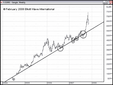
In other words, a trendline can help you identify the market’s trend. Consider this example in the price chart of Google.

That one trendline – drawn between the lows in 2004 and the lows in 2005 – provided support for a number of retracements over the next two years.
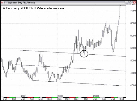
That’s pretty basic. But there are many more ways to draw trendlines. When a market is in a correction, you can draw a trendline and then draw a parallel line: in turn, these two parallel lines can create a channel that often “contains” the corrective price action. When price breaks out of this channel, there’s a good chance the correction is over and the main trend has resumed. Here’s an example in a chart of Soybeans. Notice how the upper trendline provided support for the subsequent move.

